
Apple’s Monochromatic Elegance: The Power of Minimalism in Branding

 In the tech and design sectors, Apple stands out as a brand par excellence.

Its innovative gadgets, cutting-edge technology, and luxurious brand persona have made it a favorite among global consumers. A standout feature of Apple’s brand is its understated color choices. Apple’s design ethos revolves around keeping things simple.

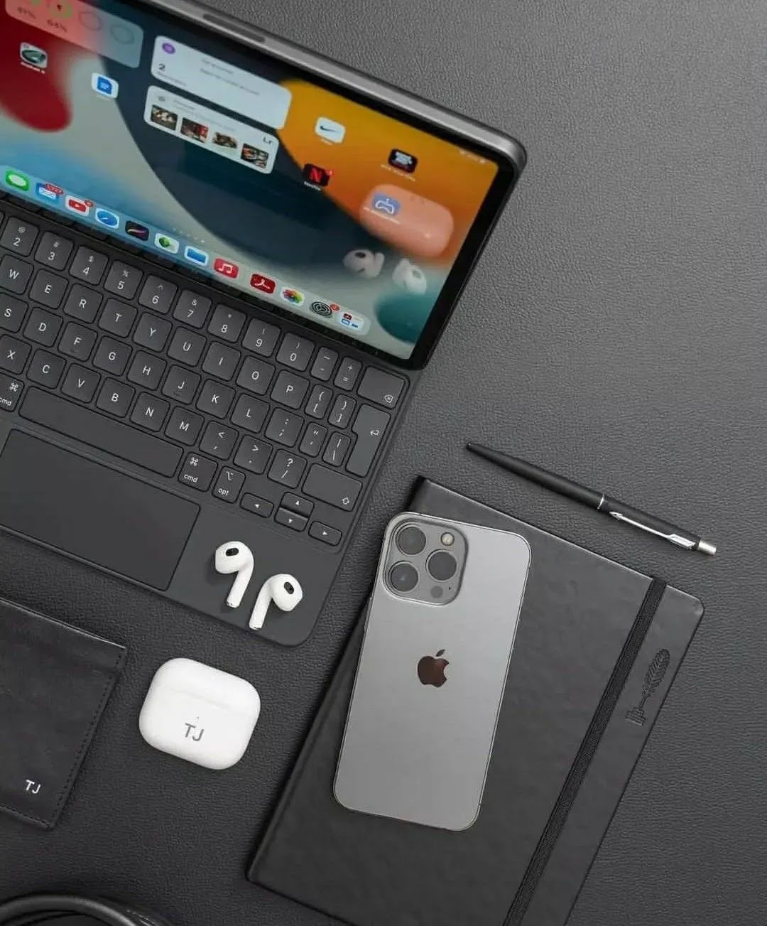
The monochrome shades of black, silver, and white epitomize this.

These unembellished colors communicate a message of elegance, transparency, and refinement. In an age of information overload, Apple’s pared-down style offers a refreshing contrast.

Historically, the shades of black and silver have symbolized affluence. Consider luxury vehicles, elite timepieces, or top-tier credit cards. Apple, by consistently featuring these colors, taps into the innate perceptions consumers hold about them. The outcome? Apple is viewed as an upscale brand, crafting elite products for discerning customers.

White, from a color psychology perspective, signifies purity, immaculateness, and dependability.

Apple’s extensive use of white, whether in their gadgets or spotless stores, instills a feeling of trust.

On a subconscious level, consumers feel reassured that they’re making a quality purchase. Beyond its luxurious connotations, silver also symbolizes progress and innovation.

Silver has a futuristic vibe. By incorporating silver into its products, Apple positions itself at the forefront of technological advancement, always a step ahead of its competitors.

Colors can stir emotions. Apple’s choice of a monochrome palette induces feelings of calm and serenity. There are no overwhelming stimuli or stark contrasts. This peaceful ambiance allows consumers to feel more relaxed, empowered, and emotionally tied to the brand.

Apple’s subtle monochrome isn’t merely an aesthetic decision; it’s a calculated strategy that leverages the profound psychological connections people have with colors.

Through its minimalist color choices, Apple amplifies its reputation for luxury, innovation, and reliability.

In the competitive world of branding, Apple’s color strategy distinguishes it, marking it as a symbol of class amidst a backdrop of chaos.

Comments

  1. This is beautiful.
    And it explains what I have been describing to people for the longest time in detailed paragraphs.

    Amazing work sir📍

    ReplyDelete

Post a Comment

Popular posts from this blog

Scarlet Screens: A Tale of Social Media Obsession

Scarlet adjusted the angle of her phone, capturing the late afternoon sun just right. Her fingers danced over the screen, adding filters and witty captions. Every post was a carefully crafted masterpiece, a vibrant splash of color in the vast sea of social media. She hit 'post,' and like clockwork, the likes and comments began to pour in. This was her world, a digital realm where she was queen, adored and envied. But behind the screen, her eyes betrayed a flicker of uncertainty, a whisper of something missing. As the sun dipped lower, casting long shadows across her room, Scarlet's phone pinged - a message from Azure, her childhood friend. "Remember when we used to chase sunsets, not likes?" it read. Azure, always the voice of reason, stood in stark contrast to Scarlet's flamboyant persona. A wave of nostalgia washed over her, a longing for simpler times, but the siren song of notifications quickly pulled her back. Scarlet's journey through the labyrinth o

2024 Web Design Color Trends: Boost Your E-commerce Website's Appeal

Introduction In the dynamic world of e-commerce website colors, understanding web design color trends is crucial for creating visually appealing and effective online stores. As we enter 2024, let's explore the top color schemes that can elevate your website's user experience and potentially improve your search engine rankings. Top E-commerce Website Color Schemes for 2024 Earthy Tones Earthy tones in web design, including organic browns, nature-inspired greens, and muted oranges, are trending for e-commerce websites in 2024. These colors evoke a sense of sustainability and authenticity, perfect for eco-friendly brands and natural product websites.  Examples: Farm Food , Eleven Plants , Allbirds , Soilboy    Neon Colors Vibrant neon colors are among the top web design color trends for 2024. Electric blues, hot pinks, and lime greens can significantly boost user engagement on e-commerce platforms, especially for tech and fashion brands targeting younger audiences. Examples: Su

How To Use Color Theory To Enhance User Experience in E-commerce Platforms

Introduction In the fast-paced world of e-commerce, first impressions matter. One of the most powerful tools at your disposal to create that lasting impact is color. Color theory isn’t just for artists and designers—it’s a critical aspect of user experience (UX) design that can influence how customers perceive your brand, navigate your site, and make purchasing decisions.  What is Color Theory? Color theory is the science and art of using color. It’s about understanding how colors interact, how they affect our emotions, and how they can be combined to create visually pleasing and effective designs. At the heart of color theory is the color wheel, a circular diagram of colors that helps you see the relationships between primary, secondary, and tertiary colors. Primary Colors: Red, blue, and yellow. These colors cannot be made by mixing other colors. Secondary Colors: Green, orange, and purple. These are made by mixing primary colors. Tertiary Colors: Colors made by mixing a primary and