Introduction
In the dynamic world of e-commerce website colors, understanding web design color trends is crucial for creating visually appealing and effective online stores. As we enter 2024, let's explore the top color schemes that can elevate your website's user experience and potentially improve your search engine rankings.
Top E-commerce Website Color Schemes for 2024
Earthy Tones
Earthy tones in web design, including organic browns, nature-inspired greens, and muted oranges, are trending for e-commerce websites in 2024. These colors evoke a sense of sustainability and authenticity, perfect for eco-friendly brands and natural product websites.
Examples: Farm Food, Eleven Plants,Allbirds, Soilboy
Neon Colors
Vibrant neon colors are among the top web design color trends for 2024.
Electric blues, hot pinks, and lime greens can significantly boost user engagement
on e-commerce platforms, especially for tech and fashion brands targeting younger audiences.
Examples: Supernatural, Transform Festival
Minimalist Black and White
This timeless color scheme creates a high-contrast, elegant look ideal for luxury brands and
professional services.
Apple's website exemplifies this trend.
Examples:ESNTLS,SneakerShout,Apple
Soft Pastels
Gentle on the eyes, soft pastels create a calming atmosphere suitable for lifestyle blogs and
personal websites.
Examples:Melula, Authentic Brief
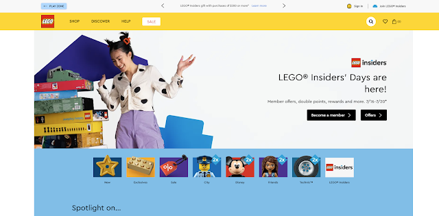
Bold Primary Colors
Primary colors can create a vibrant, playful look, perfect for educational websites and
children's products.
Examples: Taproot, Jones Bar-B-Q , Lego
Gradient Backgrounds
Gradients add depth and dimension to a website, moving away from flat design. Popular combinations include vibrant hues transitioning smoothly into each other, such as purple to pink or blue to green.
Suitable for creative industries, tech companies, and modern e-commerce platforms looking to add visual interest.
Examples: Minna, Baobla, Stripe
Monochromatic Schemes
Using various shades of a single color creates a cohesive and harmonious design.
This approach can add sophistication and simplicity while allowing for subtle complexity.
Ideal for brands looking for a clean, professional look, such as corporate websites and portfolios.
Examples: Ugly Drinks, Hues Harmony
Dark Mode
Dark mode designs use dark backgrounds with light text, reducing eye strain and creating a sleek, modern look.
This trend is not only aesthetic but also functional, as it can save energy on OLED screens.
Commonly used in tech apps, developer tools, and websites catering to users who prefer a darker interface.
Examples: Devon Stank, Tiktok Marketing partners, Slumber, Netflix
Metallics and Shimmer
Metallic colors like gold, silver, and bronze add a touch of luxury and sophistication.
These colors can be used sparingly to highlight important elements and create a sense of exclusivity.
Perfect for luxury brands, high-end e-commerce, and products that want to convey a premium feel.
Examples:Tappezzeria novecento
Muted and Desaturated Colors
Muted and desaturated colors like dusty rose, sage green, and soft grey create a subtle and understated look. These colors are less intense and can create a calm, sophisticated atmosphere.
Ideal for minimalist brands, modern web designs, and websites aiming for a relaxed and elegant user experience.
Website Examples: Wildbrand, Omega Yeast, Readcereal
Best Website Color Palettes for User Experience
When selecting website color schemes, consider how they enhance user experience. The right combination can guide users through your site, highlight important information, and create a cohesive visual journey. Color psychology in web design plays a crucial role in creating emotional connections and improving brand recognition.
How to Choose Colors for Your Online Store
- Use as Accent Colors: Incorporate trend colors into call-to-action buttons and icons.
- Backgrounds and Sections: Utilize softer tones for larger areas.
- Text and Fonts: Ensure good contrast for readability.
- Product Displays: Use contrasting colors to make products stand out.
- Seasonal Updates: Refresh your color scheme periodically.
Testing and Iteration: Continuously test different color combinations.
SEO-friendly Color Choices for E-commerce Websites
Selecting the right color palette can influence not only user experience but also search engine optimization. Colors that improve readability, reduce bounce rates, and increase time on site can indirectly boost your e-commerce website's SEO performance.
Color Accessibility
Ensuring color accessibility in your e-commerce website design is crucial for both user experience and SEO. Google's algorithm favors websites that prioritize accessibility, potentially improving your search rankings.
Use tools like the Adobe Color and WebAIM Contrast Checker to verify that your color choices meet accessibility guidelines.
Cultural Considerations
Remember that colors can have different meanings across cultures. Research your target audience's cultural context to make informed color choices that resonate universally.
Basic Color Theory
Understanding basic color theory can help you create harmonious and visually appealing designs. Here are a few concepts:
Complementary Colors: Colors opposite each other on the color wheel (e.g., blue and orange). These create high contrast and vibrant looks.
Analogous Colors: Colors next to each other on the color wheel (e.g., blue, blue-green, and green). These combinations are harmonious and pleasing to the eye.
Triadic Colors: Three colors evenly spaced around the color wheel (e.g., red, yellow, and blue). These create balanced and dynamic color schemes.
Learning from Experts: Building Authority and Trust
Gaining insights from color consultants and web design experts can provide valuable guidance. According to renowned color consultant Faber Birren, “Color is a power which directly influences the soul.”
Real-world case studies show that companies incorporating trend colors see a significant boost in user engagement and conversions.


This article on the 2024 web design color trends is both insightful and informative! It offers a fantastic breakdown of how to elevate website aesthetics through color choices that are not just trendy but also effective for user engagement. The way the article combines design principles with practical advice makes it a valuable resource for anyone looking to refresh their online presence. A must-read for web designers and digital marketers alike!
ReplyDelete